REvolution Investments Group
Webpage and Mobile Design
Project Prompt: A complete UX/UI design and build project for a financial firm, focusing on clarity, accessibility, and performance.
My Role: UX/UI Design, Front End Developer
Deliverables: Website design and build — Homepage, About, Services, Contact, Terms, and Resource Hub
Software: Figma, WIX
Timeline: May- September 2025
In summer 2025, I collaborated with Chien Industries, a Austin-based -based marketing agency, to design and build a new website for REvolution Investments Group, a financial firm seeking a modern digital presence that better reflected its credibility, transparency, and client-first values.
The project was a fixed-scope, milestone-based engagement, covering UX design, UI design, and front-end development. The goal was to create a responsive, SEO-optimized site with an easy-to-navigate structure and a centralized resource hub to help users find insights efficiently.

Starting Point: Inspiration & Direction
The project began with a set of design inspirations that the Chien Industries team had collected. These references showcased layouts, typography styles, and content approaches they admired from other financial and consulting firms.
My role was to interpret these inspirations — not replicate them — and translate them into a unique, consistent, and brand-aligned website design for Revolution Investments.
This process involved extracting what worked visually and structurally, then blending those ideas with the client’s voice and goals.
The client’s website was outdated and lacked clear hierarchy or modern responsiveness. Financial content can feel dense, so our goal was to build trust through clarity and make complex information approachable.
Key challenges:
-
Developing an intuitive site structure that balances marketing and educational content
-
Designing a scalable Resource Hub with search and filtering
-
Creating a responsive design system for desktop, tablet, and mobile
-
Maintaining strong accessibility and SEO for long-term performance
A key challenge was blending strong UX with the look and feel of a home-rental booking platform. I needed to make the site feel intuitive and familiar—similar to browsing Airbnb while still reflecting the professionalism of a real estate investment firm.
The goal was to balance approachability with credibility, creating an interface that guides users naturally through listings, CTAs, and company information.

I began by identifying recurring patterns in the reference designs — page flow, content modules, and UI components. From there, I created:
-
A sitemap and page structure covering Homepage, About, Services, Contact, and a dynamic Resource Hub.
-
Wireframes that balanced strong visuals with user-friendly navigation.
This stage focused on converting ideas into functional layouts — merging business objectives with clean usability.
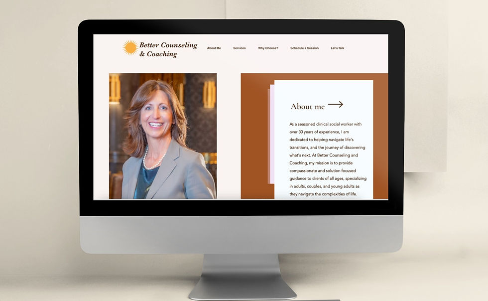
Once the structure was set, I designed high-fidelity mockups in Figma, guided by a modern and professional tone.
The visual identity centered around bold blues, ample white space, and structured layouts that build user trust.
I also designed reusable UI components that could be replicated within Wix CMS — allowing content editors to manage updates easily post-launch.
-
Modular section blocks adaptable across pages
-
Responsive design system tested for desktop, tablet, and mobile
-
Resource Hub interface with categorized cards for easy navigation
-
Clean call-to-action flow from awareness to conversion

Throughout this phase, the mockups were revised multiple times to find the right alignment between layout, usability, and brand clarity. Each iteration refined the visual hierarchy, text flow, and navigation to create a seamless experience that felt intuitive and trustworthy.


Once the desktop layout was finalized, I transitioned the design into mobile formats to ensure a seamless cross-device experience. Using Figma’s Auto Layout and responsive constraints, I restructured components, simplified navigation patterns, and optimized spacing for smaller screens.
This step ensured that the interface remained intuitive, readable, and consistent—whether viewed on desktop, tablet, or mobile.

After mockups were approved, I implemented the final design in Wix CMS, focusing on:
-
Building a custom layout system that mirrored the Figma prototypes
-
Setting up dynamic collections for blog and resource pages
-
Integrating SEO metadata and Google Analytics
-
Ensuring accessibility and performance consistency across modern browsers
The CMS approach allowed the client to easily edit and scale content without developer dependency — a major usability win for their long-term operations.


The final website delivered:
-
A polished, responsive design aligned with the firm’s professional image
-
Improved structure and readability
-
40% faster performance after optimization
-
Positive client and agency feedback for its cohesive, modern look
This project demonstrated the value of collaboration and creative interpretation — transforming a set of inspirations into a fully realized design system.
It reinforced my ability to balance client vision, technical execution, and UX clarity to deliver a professional, performance-driven website.
Read more of my case studies