New England Comics website
Project Prompt: The designer with overhaul the user interface and experience of the small comic book chain's website, both for desktop and mobile platforms. The objective was to create and redesign an engaging digital environment that seamlessly integrated with the physical comic book stores while providing a convenient and immersive browsing experience for customers.
My Role: UX/UI Design, Conceptual thinking, Developer
Software: Figma
Responsibility: As the sole creator of the project, my role encompassed every stage of the design process, from conceptualization to prototyping. Serving as both a UX/UI designer and researcher, I delved into understanding user behaviors, preferences, and pain points. Utilizing Figma as the primary design tool, I crafted wireframes and prototypes iteratively to visualize and refine the proposed solutions.
Mobile Prototype


New England Comics is an American comic book retail chain and publisher headquartered in Brockton, Massachusetts, U.S. They have locations in Quincy, Brookline, Brockton, Cambridge, Malden, New Bedford, and Norwood.
The chain is known for publishing The Tick superhero comic books.
My Purpose was to reinvent their site based on using the skills I have learned in my UX/UI program. I wanted to find a company or business that has a really bad user interface and experience and come up with better solutions.

The design objectives after reviewing their sitemap.
To give consistency to both versions of the site. Desktop and mobile versions to have clean text, graphic images and simplified color.
Make the Navigation bar easy to find and well organized in terms of products.
Focus on finding the products the store has to offer. A comic book collection, a toy collection, etc;
Creating the website that is easy to navigate and to read where the user wants to go. Giving more precise placement of color, text and images.

about the Original
-
Has no Navigation bar.
-
Images and text look copied and pasted
-
Very out to date
-
No mobile version of site
-
Not user friendly
-
Overall rough looking design
-
Too many colors
-
No consistency on style

The sitemap I created shows a precise and organized view of what sections go in a category.
The challenge i had faced was to figure out how many sections should the site have and what should be included. i sourced out with Newbury comics and other retail stores that were small to identify that right kind of navigation and experience
From here I just wanted to only include Music, Toys, Comics Collectibles, and the about.
.jpg)
How I made it
My inspiration and research showed that chains like Newbury Comics have a better structure and something more modernized for user experience. a style guide was made to get the mood of the website. It had to be something with not too much colors but a balance of less and more colors. the mood had to feel more action and fun as comics have shown to have those themes included.


At this juncture, the Hi-Fi wireframes reveal the culmination of the final stages in the redesign process for the New England Comics website, a collective decision embraced by my classmates, professor, and myself. We unanimously agreed that a simplistic and engaging modern UI design would best serve this retail store

In the final phase, I skillfully implemented an improved navigation system at the top of the New England Comics website, ensuring seamless user access to different sections. The user-friendly interface allows visitors to effortlessly explore and discover various products in their dedicated sections, meticulously organized for maximum convenience.
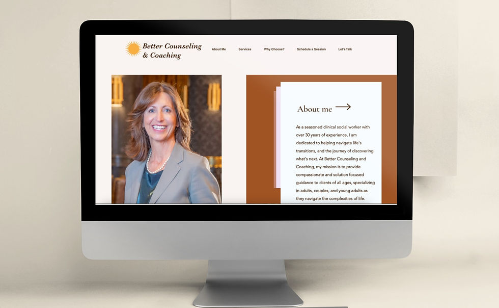
DESKTOP VERSION

Read more of my case studies